RoasterTools
I spearheaded a redesign of the RoasterTools Orders page to make it easier for coffee roasters to manage their invoices. To preserve confidentiality, many sections of this case study are kept offline. If you would like to learn more, please contact me!
Themes
UX Design
Interaction Design
Supervisor
Jon Ewalt, CEOTools
Figma
Adobe Illustrator
Timeline
1 month
April 2020 - May 2020
Intro
Managing A Coffee Roastery Is Hard — Enter RoasterTools
It is extremely unlikely that people get into roasting coffee because they love the everyday mundane tasks that are required to stay organized and maximize their efficiency.
At RoasterTools, we have a platform that allows coffee roasters to outsource their operations tasks and focus on their true passion — roasting coffee.
DESIGN DIRECTION
Designing the Familiar
With thousands of active users, the RoasterTools Orders page redesign had some significant challenges. The new concept needed to increase the page’s functionality, while remaining consistent and familiar to the rest of the app.
While working within the existing design system had its limitations, it also minimized the dev lift required to implement the new design, and it mitigated the risk of alienating existing users who have become accustom to the existing system.
When sketching out new concepts for the Orders page, I kept these ideas at the forefront of my mind.

The End Result
Increased Functionality in a Familiar Form
My goal was to design a simple, friendly experience that would empower all users to complete their tasks more efficiently. Below is a look at the final concept.
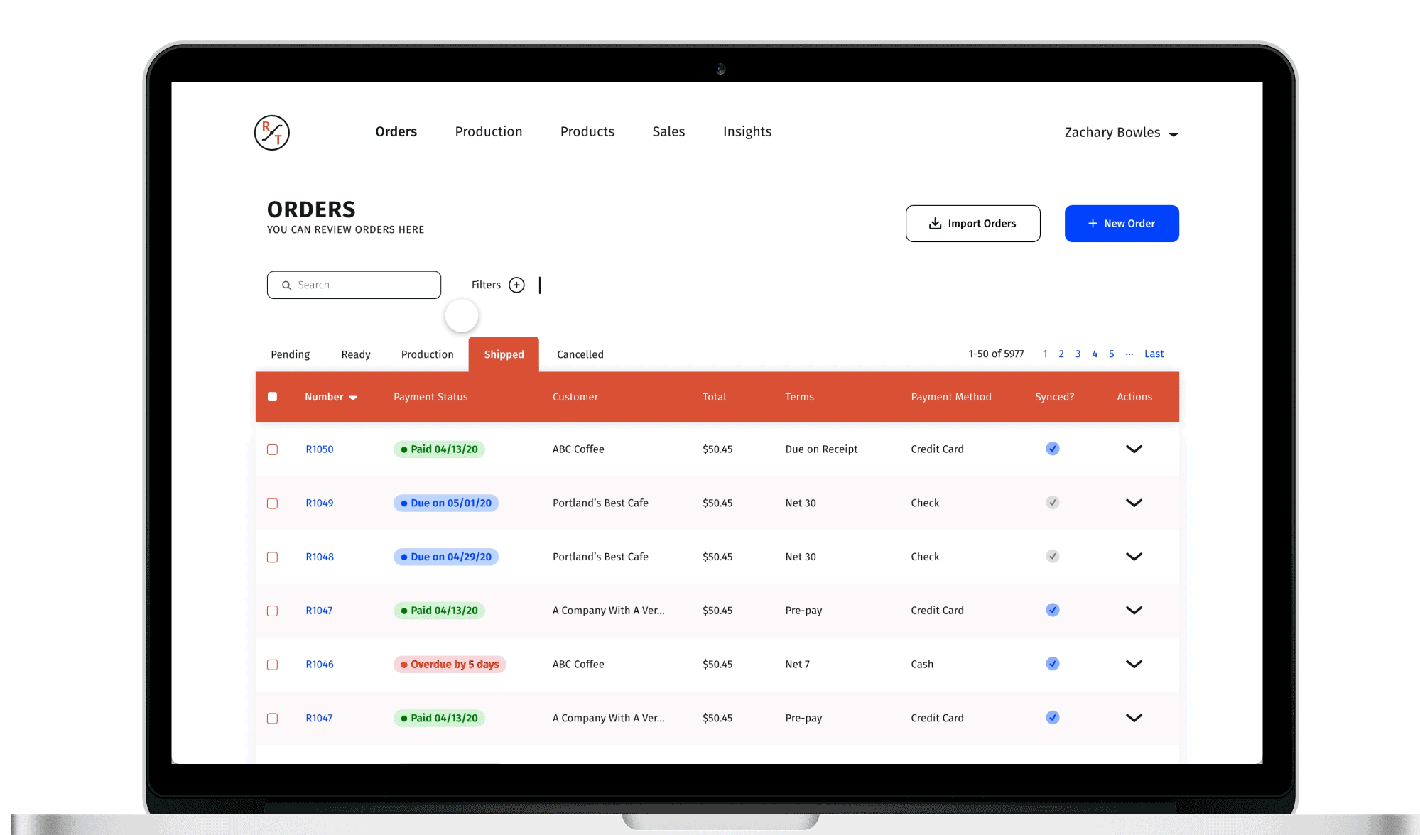
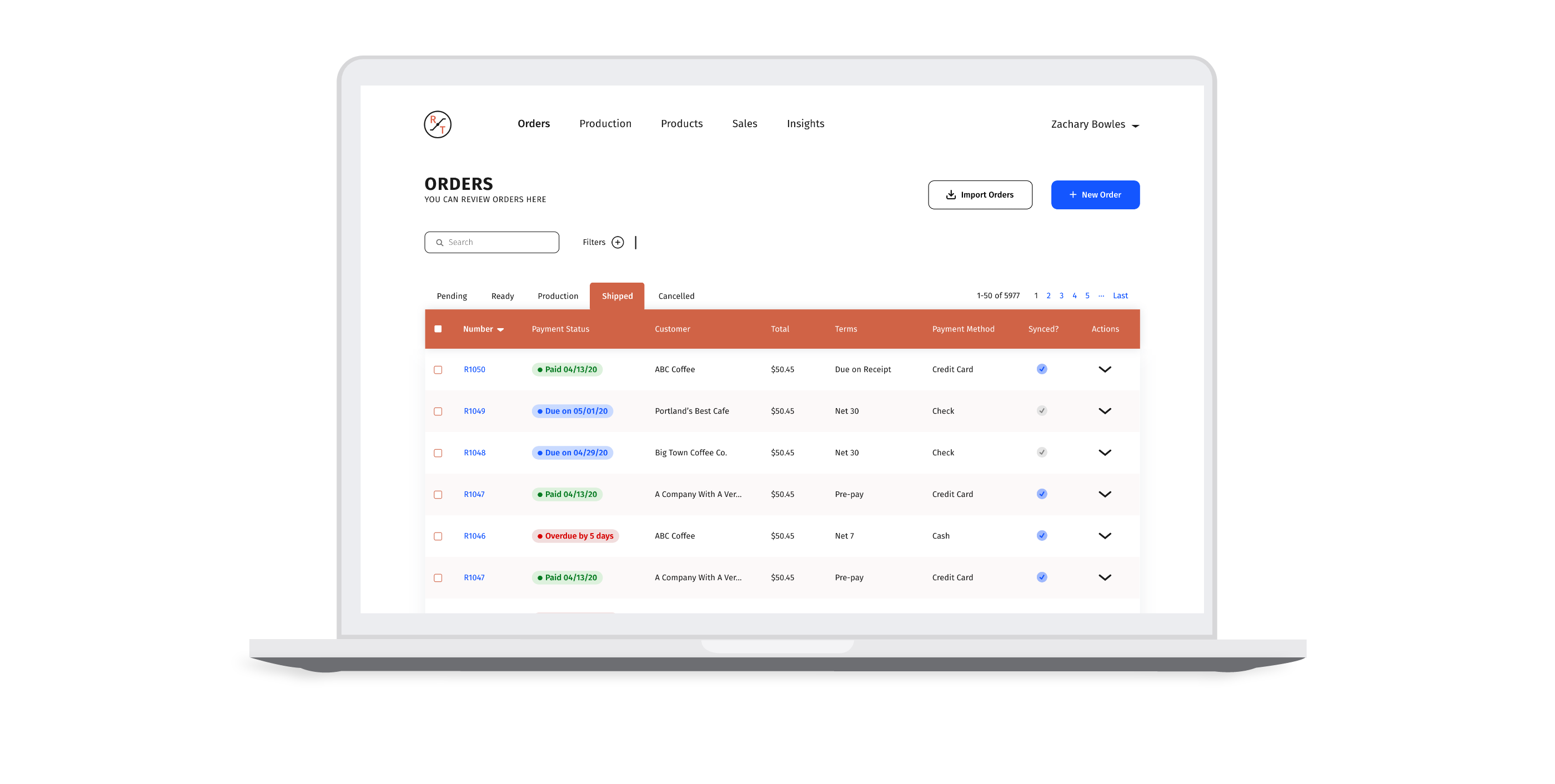
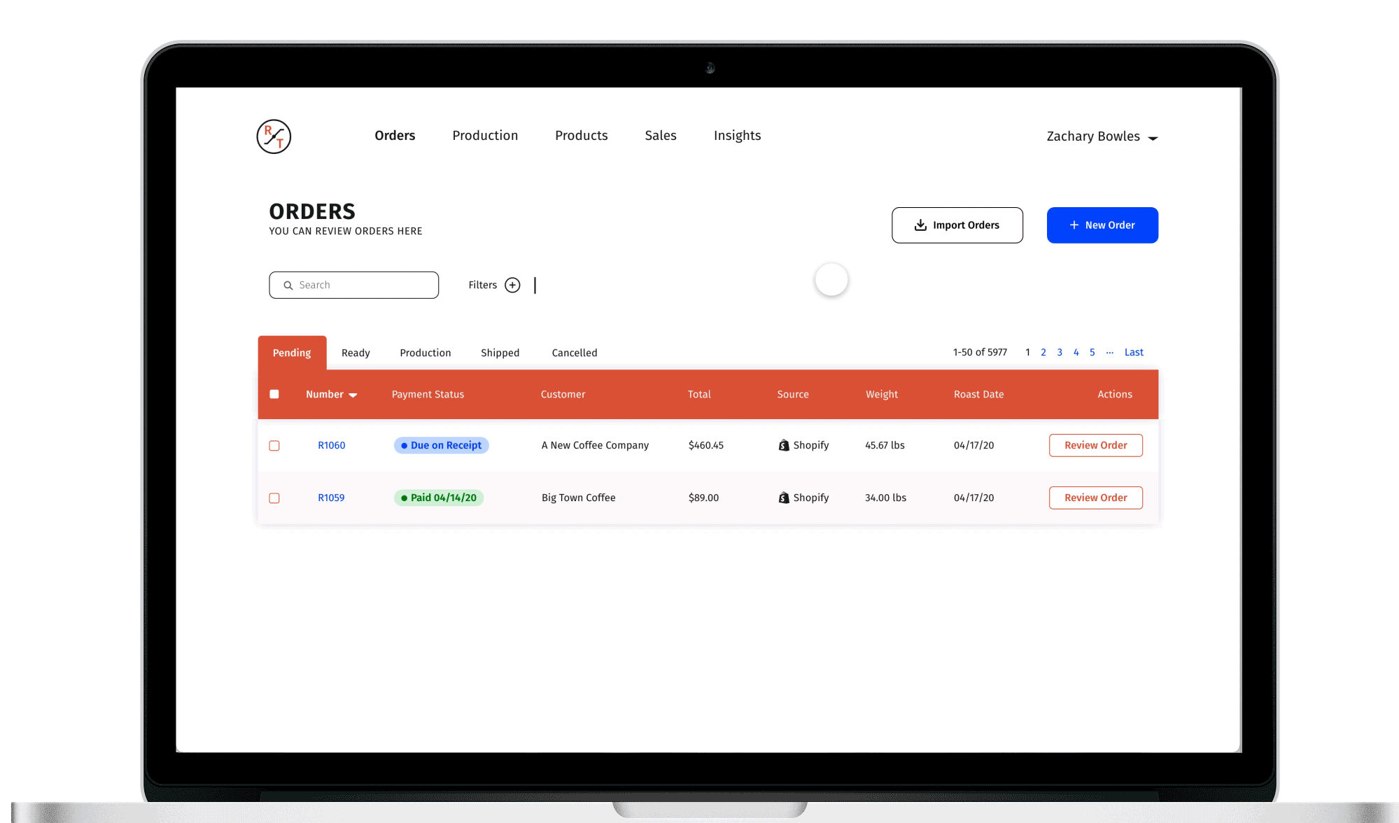
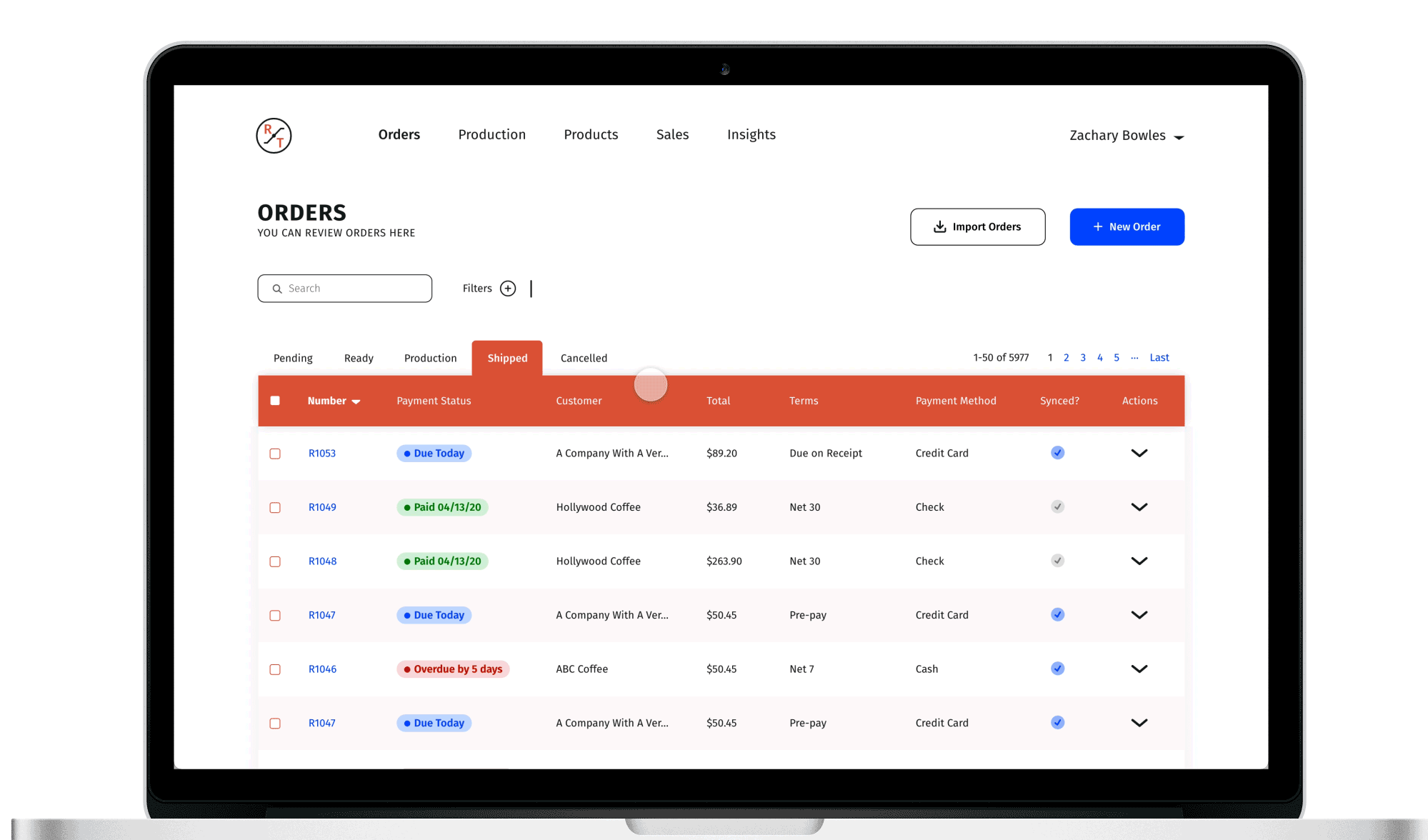
One of the biggest issues with the existing Orders page, is that the information displayed on the tables is static. It doesn’t matter if an order is in a Ready or a Shipped state, the information displayed does not change. This is flawed because users need to perform different tasks depending on the state of the order. In the redesign, information displayed for each invoice is dynamic and will change depending on the state of the order, ultimately helping users complete their tasks and fulfill orders more quickly.
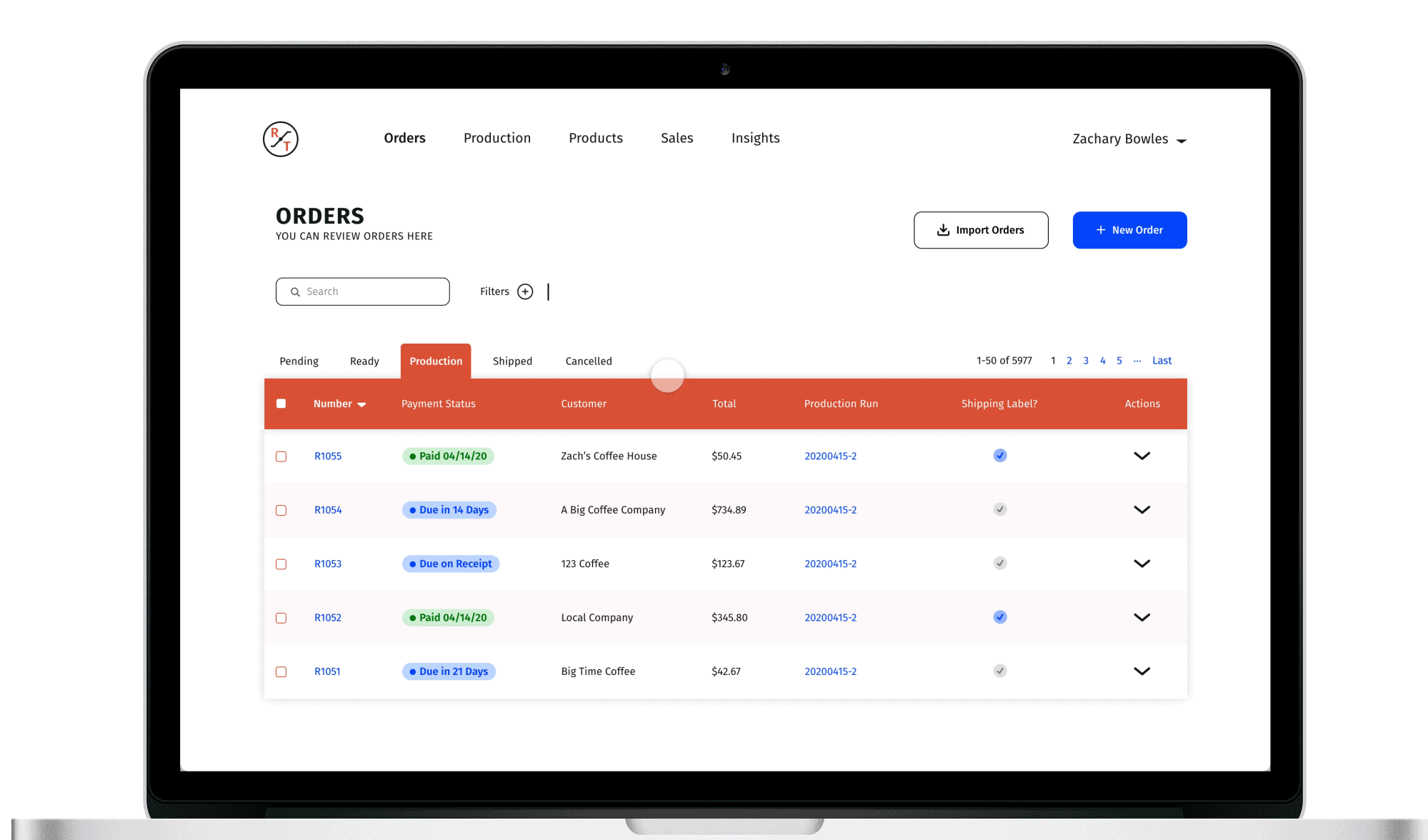
In the current Orders page, each invoice has a Pending, Ready, Production, or Shipped tag. These tags correspond to the page that each invoice is in and are therefore redundant. In the redesign, I removed these tags and replaced them with Payment Status tags. This will make it easier for users to see which invoices are still outstanding at a glance. In addition, I made every column sortable, so users will be able to sort invoices by these tags if necessary.
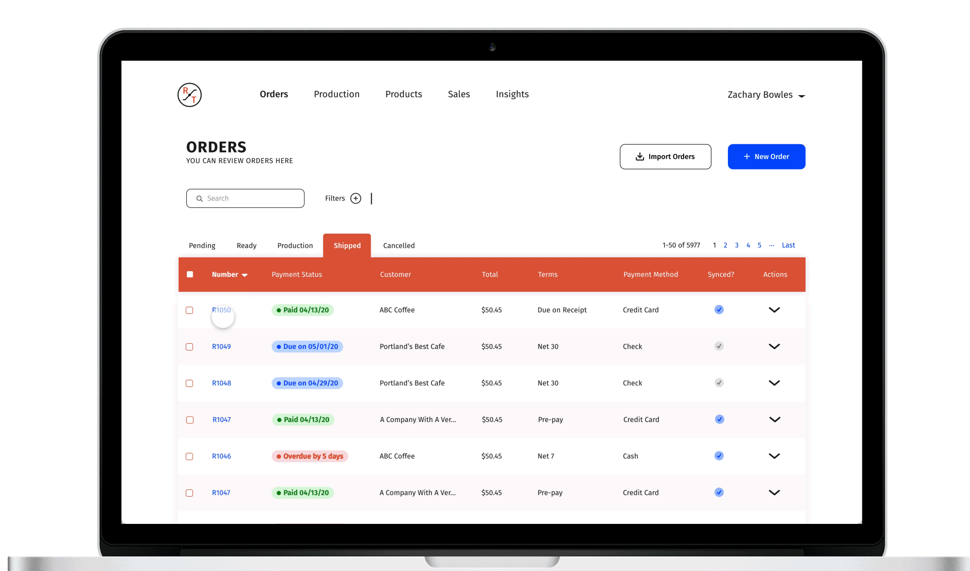
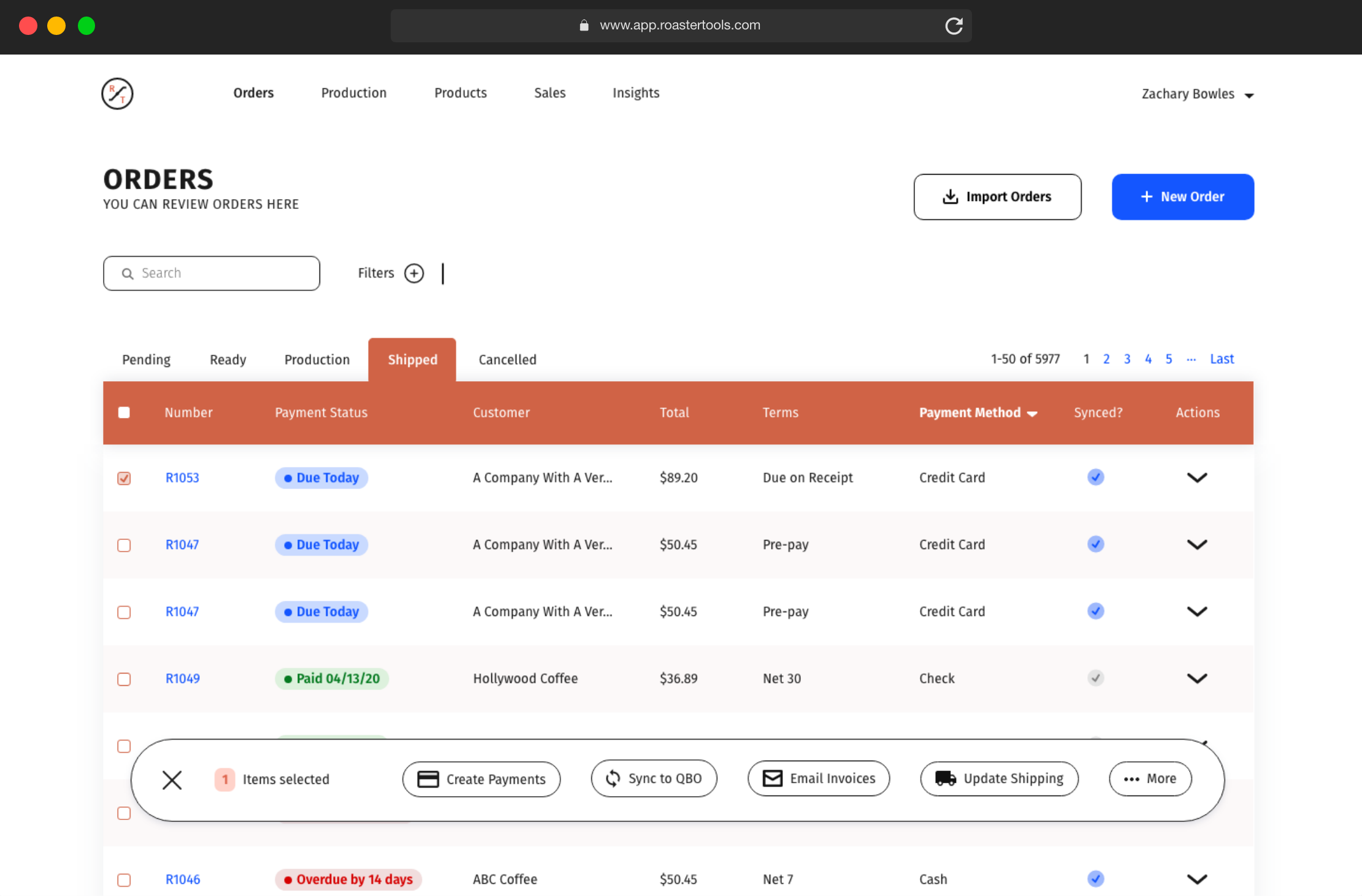
One of the biggest issues with the existing orders page is ambiguity around batch actions. Many batch actions can’t be run, unless every invoice matches specific criteria. For example, batch payments may only be made if every invoice is set up to pay by Credit Card.
To fix this issue, I created new table columns on the Shipped page, to display the default payment and terms for each customer. Now, users will be able to quickly see all invoices set up with a Credit Card, and create batch payments for those invoices.
lessons
The Art of Thoughtful Reduction
The biggest challenge of this project was simplifying a complex data-driven page, without losing functionality and while retaining existing UI guidelines. These constraints forced me to make difficult decisions and to think critically about the information users needed to get an order from a Pending state to a Shipped state.
In the end, I think this redisign does a great job of highlighting important information at the right time, by removing extraneous details and will help users complete their tasks far more efficiently. If this idea is implemented, it will greatly increase the usability of the Orders page for RoasterTools users, while remaining consistent and familiar to them.
Want to see the full case study or chat over Zoom about design projects? Contact me!