Nest Egg
A new real estate investment platform targeted at millennials and first time buyers.

Themes
UI Design
Interaction Design
Project Advisor
John SalisburyTools
Adobe XD
Adobe Illustrator
Adobe Photoshop
Timeline
4 months
November 2019 - February 2020
Intro
Real Estate is Intimidating. Nest Egg Can Help
Real estate investment is an increasingly popular way for individuals to achieve financial security. It is an exciting and emotional experience, but often complicated.
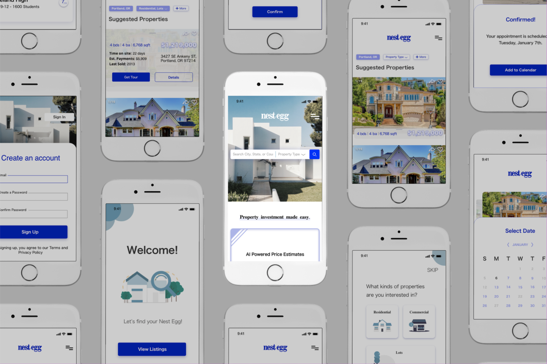
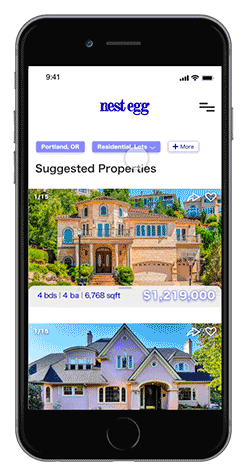
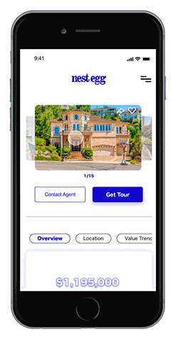
Nest Egg is a new type of Real Estate website that helps first time real estate investors break into the market. The site is designed to be minimal and clear in order to make the interface approachable regardless of your experience level.
Key Research Insight
Existing Blogs and Websites Don’t Support Inexperienced Buyers
While there are plenty of blogs and agencies providing information, often, buyers new to the market may struggle to get started without professional guidance and waste time viewing properties out of their range
DESIGN DIRECTION
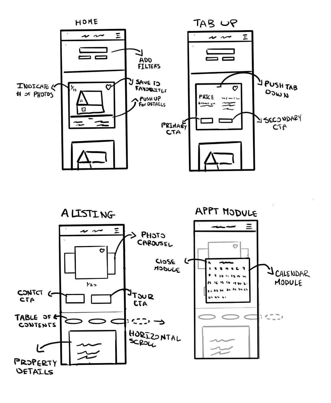
A Mobile First Approach
To begin the process, I sketched out multiple design ideas in order to discover which interfaces would provide the best user experience while appealing to a younger audience.
Switching to adobe xd
A Journey to High Fidelity
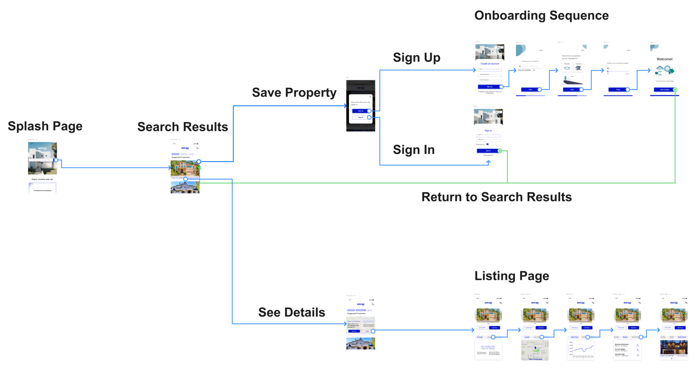
Once I had a basic design direction, I decided to switch over to Adobe XD in order to create high fidelity mockups of my designs. This allowed me to create components, adjust my designs more easily, and create a new design system that resulted in a consistent visual design.
Nest Egg
The Final Product


lessons
Don’t Neglect UX Research
Nest Egg was the first project where I was asked to simply focus on the User Interface. I was handed off a package of UX research and was asked to build an interface that met the requirements of the users. With this aim in mind, I tried to simply take the research and start building.
Unfortunately, I did not feel that the research was sufficient to build an adequate user experience. I constantly found myself going back and doing the work retroactively. The lesson I learned through this process, is that even in a UI specific project, I should never neglect the need to do extensive UX research. If I had simply acknowledged the need for better UX work, I could have saved myself many pain staking hours and produced a better final project.
Feedback on the design? Want to chat over coffee about design projects? Contact me!