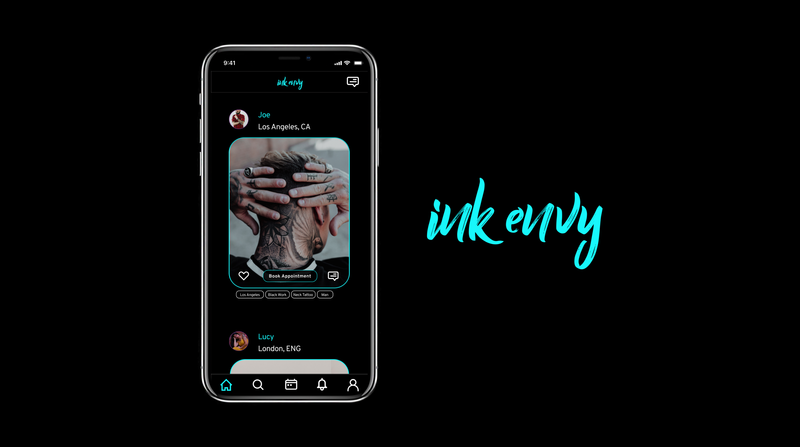
InkEnvy
A mobile app focused on helping traveling Tattoo artists connect with clients around the world.
Themes
UX Research and Strategy
UI Design
Tools
Sketch
InVision
Adobe Illustrator
Timeline
4 months
July 2019 - October 2019
Intro
Getting a tattoo can be an incredibly stressful experience.
As my mother once warned me, “Tattoos are permanent!” It is partly what makes them so personal and desirable for many people. However, it is also what makes the experience of getting a tattoo incredibly stressful.
While 32% of people with tattoos claim to be “addicted to ink,” an unfortunate 17% of people at least partially regret getting their tattoo.
Competitive Research
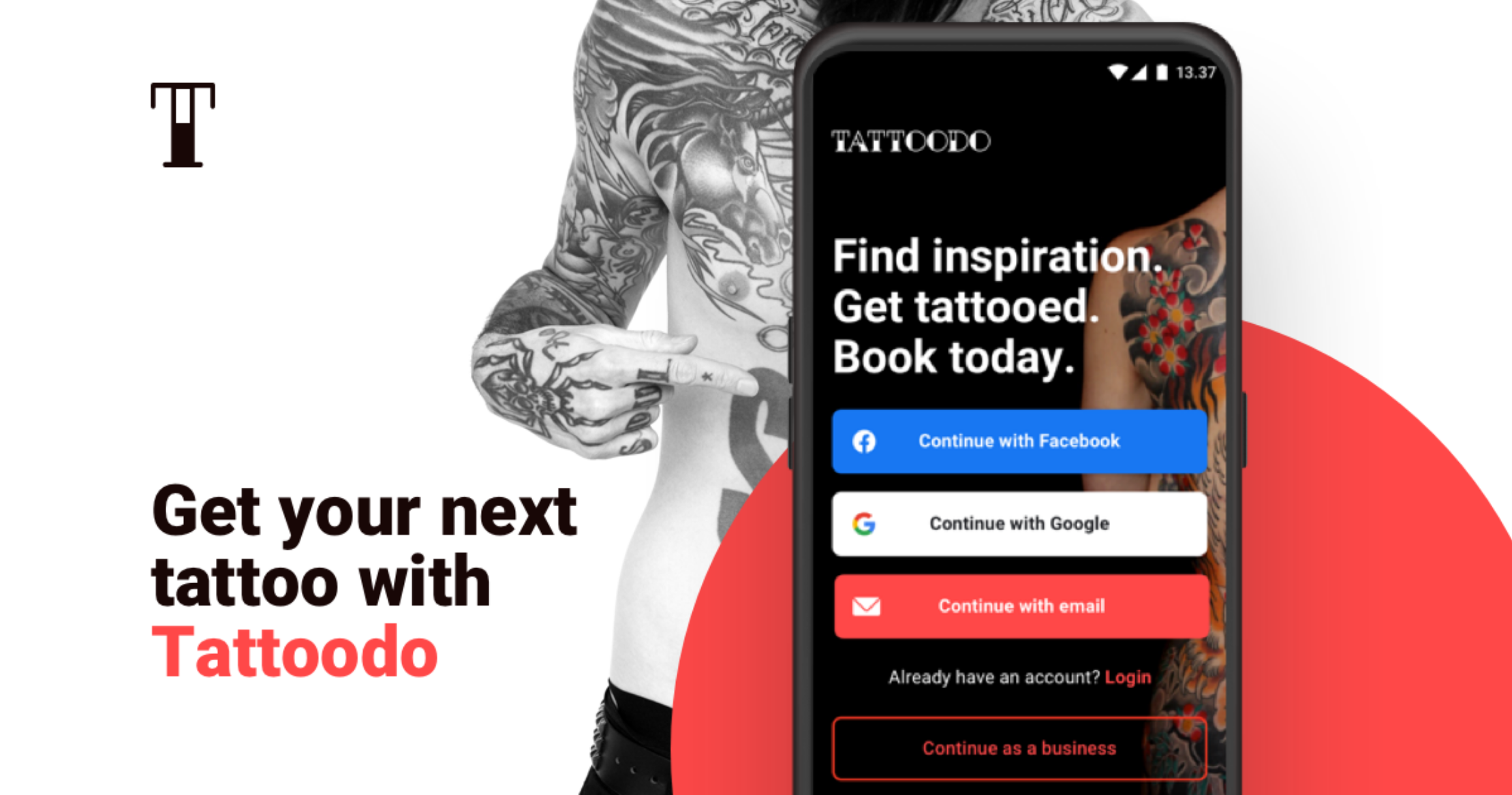
A Breakdown of Tattoodo
I began the research for this project by surveying the existing competitive market and looking for key areas where a new app could gain a foothold in the market. To this end, I found the two biggest existing competitors are Tattoodo and InkHunter.
User Research
User Interviews
“It’s annoying that on Instagram I can only search one key word at a time.”
Once I had a basic idea of my user and their needs, I decided to conduct a dynamic digital card sort with 17 cards and 3 pre-determined categories (News Feed, Profile, Discover). This gave me an opportunity to see how my users grouped content and how well they understood the copy I intended to use for the app.
Once I had completed my market study, I began researching my target audience by interviewing people in my network with tattoos or an interest in getting tattoos. This gave me further insights into their knowledge of existing apps, their needs, their goals, and their frustrations. Once I had gathered my data through interviews, I created an infinity map and outlined my 3 biggest takes aways.
- Almost all interviewees had a very limited understanding of existing apps.
- A couple of interviewees would love travel related features. Either to know when artists are in town, or to book appointments when they are traveling.
- All interviewees demonstrated a desire to be able to search using multiple key words.
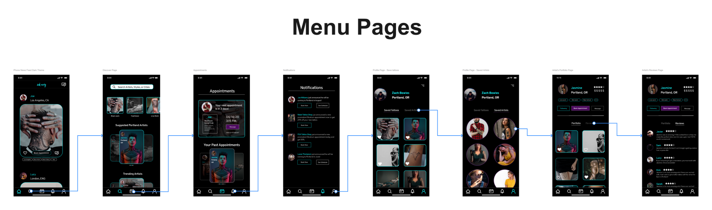
Information Architecture
Card Sorting With Constraints
Once I had a basic idea of my user and their needs, I decided to conduct a dynamic digital card sort with 17 cards and 3 pre-determined categories (News Feed, Profile, Discover). This gave me an opportunity to see how my users grouped content and how well they understood the copy I intended to use for the app.
The results of this study showed that 80% of respondents would group the same items into the Discover page, but only 53% of respondents agreed on what cards should be placed into the News Feed page.
DESIGN DIRECTION
Designing To Help Users and Artists Travel
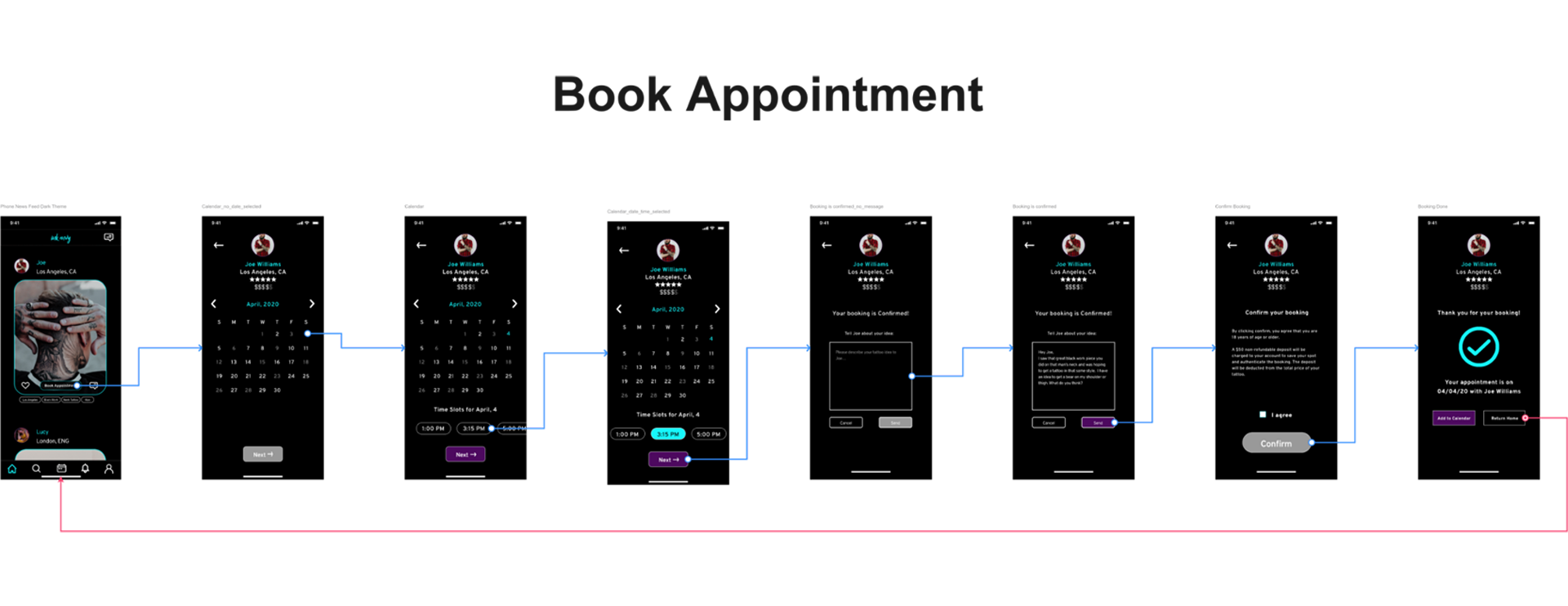
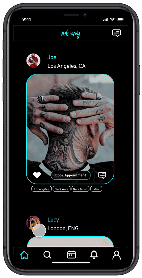
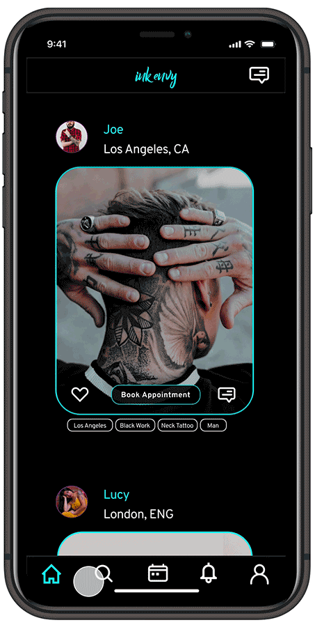
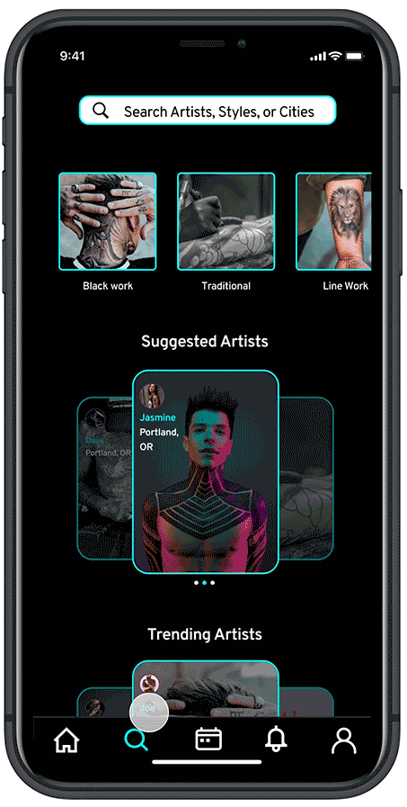
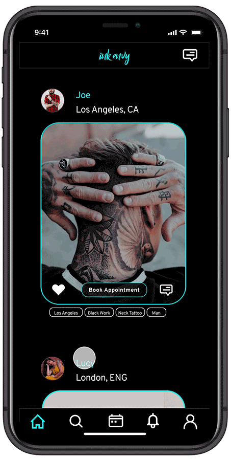
One of my biggest takeaways from my User Interviews and Competitive Research, was that there aren’t any good apps to help users or artists who love to travel. With this in mind, I set out to solve this problem by making it easy for users to find artists in new cities that they may be visiting, or simply stay up to date on the schedules of traveling artists. Too often users don’t find out that an out-of-town artists they love was close by, until it is too late. InkEnvy will solve this problem.

Switching to Sketch
A Journey to High Fidelity
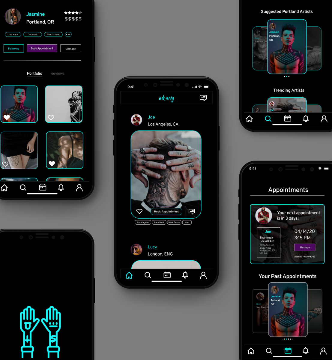
Once I had a basic design direction, I decided to switch over to Sketch in order to create high fidelity mockups of my designs. This allowed me to create components, adjust my designs more easily, and create a new design system that resulted in a consistent visual design.
Nest Egg
The Final Product

lessons
Accessibility is Not an After Thought
InkEnvy was the first product I created when beginning my User Experience journey, so the lessons I learned along the way are almost innumerable. However, my biggest takeaway once I had finished the project, was the importance of thinking about accessibility from the very beginning.
With InkEnvy, I had to try and play catch-up at the end, to ensure that my designs were still usable for all users, but in many ways, this was a lost cause. I had already committed to many design decisions and there was only so much I could do retroactively to make InkEnvy more accessible.
Going forward, I decided that I would always make accessibility a priority from the very beginning of every project. This means that when I write User Journeys, or I conceptualize new features, I always consider how it will work for users with disabilities, and ensure that their experiences will be as seamless as everyone else’s.
Feedback on the design? Want to chat over coffee about design projects? Contact me!